Widgets
This package comes with a few predefined widgets that could be used in your slide deck.
FlutterDeckBulletList
A widget that renders a list of bullet points. Bullet point items are rendered as a row with a bullet point and the text. The bullet point is rendered as a dot by default, but can be customized by providing a bulletPointWidget. The text is rendered as an AutoSizeText widget and is automatically resized to fit the available space.
If useSteps is true for the slide configuration, the bullet points will be rendered one by one as the user steps through the slide.
You can use stepOffset to offset the step number for the first item in the list. For instance, if you set stepOffset to 1, the first item will only be visible when the user steps to the second step. Remember to increase the number of steps for the slide configuration if you use stepOffset.
class FlutterDeckBulletListDemoSlide extends FlutterDeckSlideWidget {
  const FlutterDeckBulletListDemoSlide()
      : super(
          configuration: const FlutterDeckSlideConfiguration(
            route: '/bullet-list-demo',
            title: 'Bullet list demo',
            steps: 3, // Define the number of steps for the slide
          ),
        );

  @override
  Widget build(BuildContext context) {
    return FlutterDeckSlide.split(
      leftBuilder: (context) => FlutterDeckBulletList(
        useSteps: true, // Enable steps for the bullet list
        items: const [
          'This is a step',
          'This is another step',
          'This is a third step',
        ],
      ),
      rightBuilder: (context) => const Text('FlutterDeckBulletList demo'),
    );
  }
}
FlutterDeckCodeHighlight
Provides a widget that gives you customizable syntax highlighting for many languages.
This widget supports line highlighting and animated code transitions natively. You can pass a list of 0-based indices to highlightedLines to emphasize specific lines while dimming the rest. It uses syntax_highlight to parse TextMate grammars and diff_match_patch to perfectly cross-fade only the changed code segments dynamically whenever the code string updates.
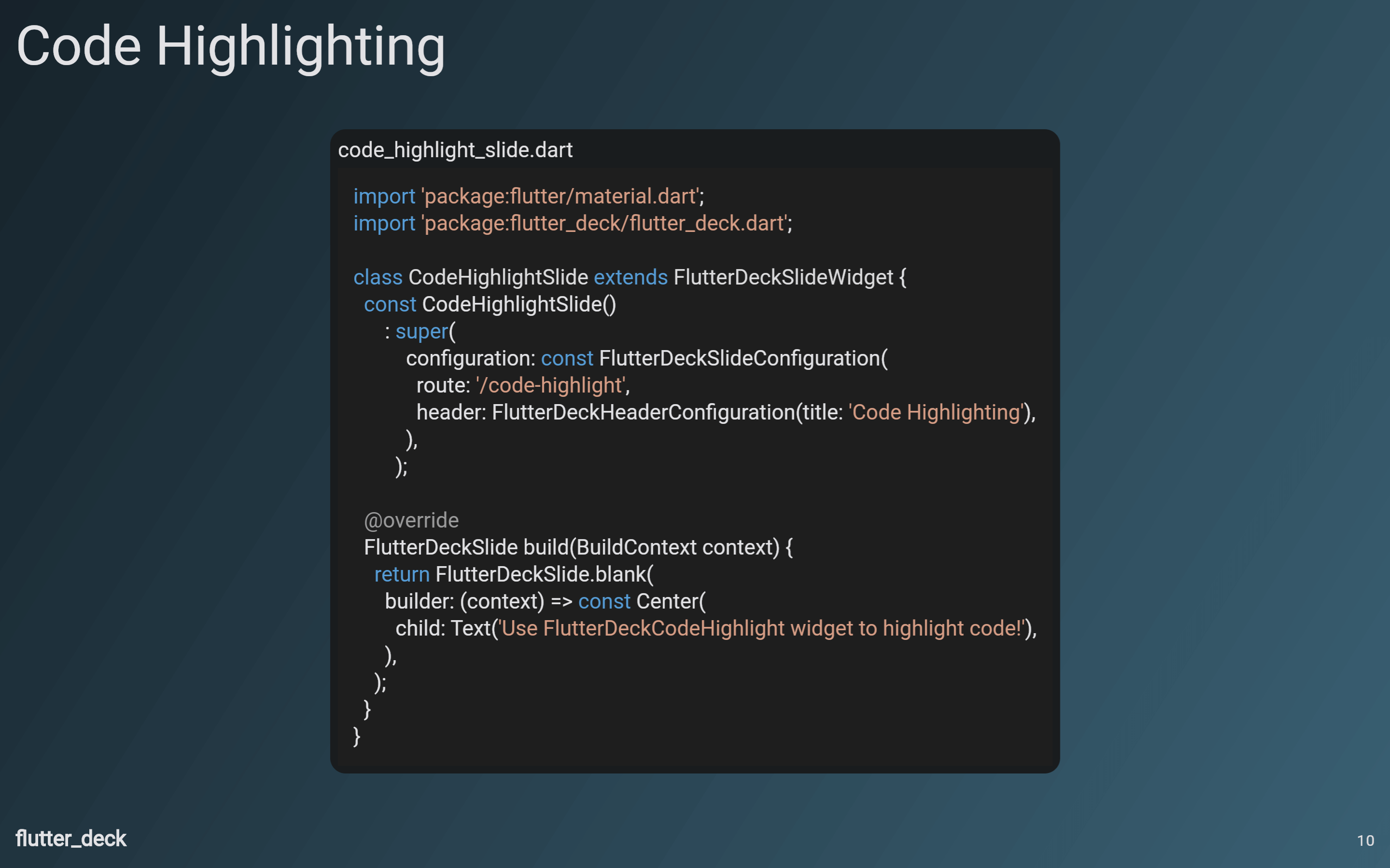
class CodeHighlightSlide extends FlutterDeckSlideWidget {
  const CodeHighlightSlide()
      : super(
          configuration: const FlutterDeckSlideConfiguration(
            route: '/code-highlight',
            header: FlutterDeckHeaderConfiguration(title: 'Code Highlighting'),
          ),
        );

  @override
  Widget build(BuildContext context) {
    return FlutterDeckSlide.blank(
      builder: (context) => const Center(
        child: FlutterDeckCodeHighlight(
          code: '''
import 'package:flutter/material.dart';
import 'package:flutter_deck/flutter_deck.dart';

class CodeHighlightSlide extends FlutterDeckSlideWidget {
  const CodeHighlightSlide()
      : super(
          configuration: const FlutterDeckSlideConfiguration(
            route: '/code-highlight',
            header: FlutterDeckHeaderConfiguration(title: 'Code Highlighting'),
          ),
        );

  @override
  Widget build(BuildContext context) {
    return FlutterDeckSlide.blank(
      builder: (context) => const Center(
        child: Text('Use FlutterDeckCodeHighlight widget to highlight code!'),
      ),
    );
  }
}''',
          fileName: 'code_highlight_slide.dart',
          language: 'dart',
        ),
      ),
    );
  }
}
FlutterDeckBackground
A widget that renders the background of the slide. This widget is used internally by the slide templates, but you can also use it to create a custom slide with a standard background.
FlutterDeckBackground(
  child: const Center(
    child: Text('Custom background'),
  ),
)
FlutterDeckFooter
A widget that renders the footer of the slide. This widget is used internally by the slide templates, but you can also use it to create a custom slide with a standard footer.
FlutterDeckFooter(
  showSlideNumber: true,
  showSocialHandle: true,
)
FlutterDeckHeader
A widget that renders the header of the slide. This widget is used internally by the slide templates, but you can also use it to create a custom slide with a standard header.
FlutterDeckHeader(
  title: 'Custom Header',
)
FlutterDeckProgressIndicator
A widget that renders the progress indicator of the slide. This widget is used internally by the slide templates, but you can also use it to create a custom slide with a standard progress indicator.
FlutterDeckProgressIndicator(
  value: 0.5,
)
FlutterDeckSpeakerInfoWidget
A widget that renders the speaker info. This widget is used internally by the title slide template, but you can also use it to create a custom slide with speaker info.
FlutterDeckSpeakerInfoWidget(
  speakerInfo: const FlutterDeckSpeakerInfo(
    name: 'John Doe',
    description: 'CEO of flutter_deck',
    socialHandle: '@john_doe',
    imagePath: 'assets/me.png',
  ),
)